



June 26, 20267 min read
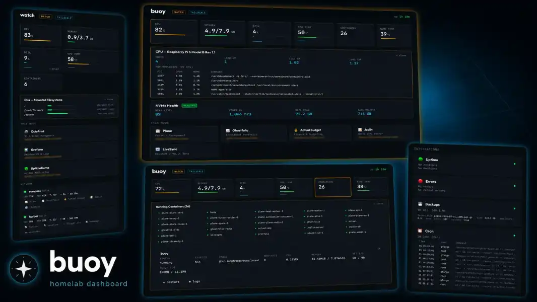
One container per machine that auto-discovers your Docker services, shows system vitals, and polls its neighbors for a whole-fleet view. Here is why I built it and how to run it.
I have three machines humming away in a closet, and for a long time checking on them meant a scatter of browser tabs and SSH sessions. Portainer in one tab, a Grafana board in another, and docker ps over SSH when I could not remember which node a given service actually lived on. What I wanted was duller than any of those: one page per machine that told me the three things I care about. Is it healthy, what is running, and can I reach it. So I built that page for myself, ran it privately for months under the boring internal name “hub”, and recently rewrote it from scratch and put it on GitHub as buoy.
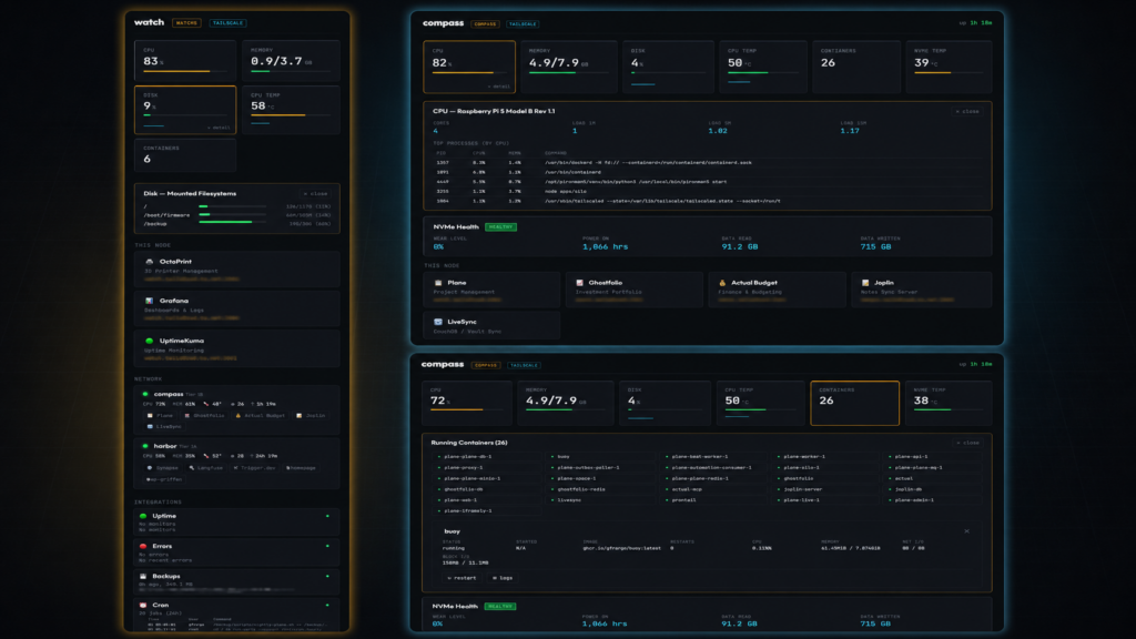
Homelab dashboards tend to sit at two extremes. On one end are the link boards: lovely grids of bookmarks that do not actually know anything about the machine they run on. On the other end are the full monitoring stacks, which know everything but want a database, a metrics pipeline, and a chunk of RAM to tell me my CPU is fine. I wanted the middle: system vitals, Docker service discovery, and a multi-node overview, in a single container with nothing else to stand up.
None of the usual suspects quite fit how I wanted to look at my own boxes. This is a fit judgment, not a ranking; they are all good at what they do.
| Tool | Why it did not fit my particular use |
|---|---|
| Homepage / Flame | Beautiful link boards, but no system vitals and no fleet view |
| Glances | Great single-node vitals, but no service discovery or multi-node grid |
| Netdata | Deep monitoring, more weight and detail than I wanted for a glance |
| Dashy / Homarr | Polished service dashboards, but no system metrics or fleet overview |
Buoy lives at the intersection: part system monitor, part service dashboard, part fleet overview, with no external database and no build step.
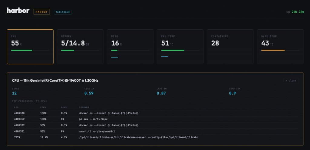
The top of the page is a row of gauges: CPU, RAM, disk, temperature, container count, and NVMe health, each with a color-coded bar and a small sparkline so you can see the last little while at a glance. Click any gauge and it expands into a detail panel: the CPU one breaks down top processes, memory shows swap, disk lists mounts with per-mount usage, and so on. Simple at a glance, deeper on a click.
Below that, buoy auto-discovers the Docker containers running on the host and turns them into a service list. You can hide noisy infrastructure containers and add display overrides (a friendly name, an icon, a port) in config. Because my homelab runs on Tailscale, the generated links are tailnet-aware: they point at the HTTPS tailnet URL when you are reaching buoy over the tailnet, and fall back to localhost otherwise.
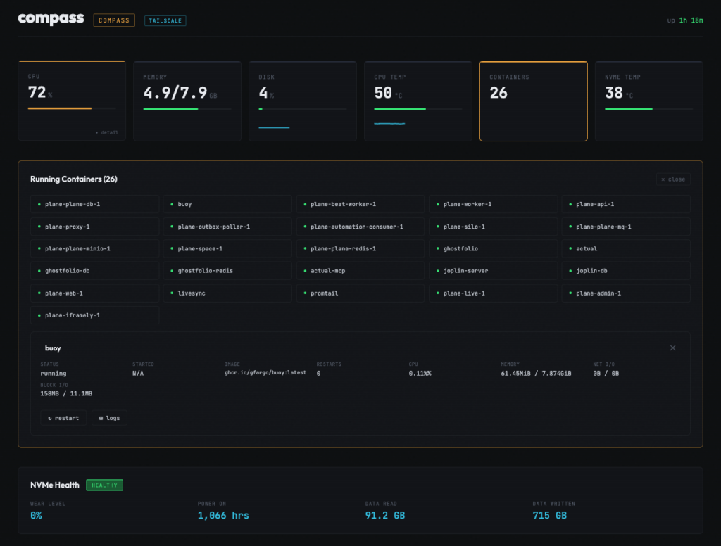
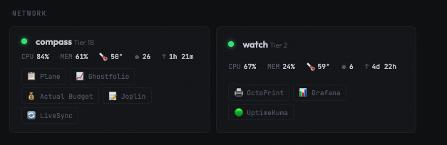
The part I use most is the fleet grid. Each buoy instance can poll its peers and render a compact per-node overview: CPU, memory, temperature, container count, and uptime for every machine, side by side. Open one node in a browser and you are looking at the whole closet. Threshold-based alerts round it out, surfacing as toast notifications over the WebSocket when something crosses a line, and a small SQLite ring buffer keeps roughly a day of history behind the sparklines.
  Browser  <--websocket / http-->  Starlette (async Python)
                                          |
                                          v
                    Collectors: system / docker / disk / network
                                          |
                                          v
Docker CLI + /proc + /sysA few decisions did most of the work here:
buoy.yaml, and any value can be overridden with a BUOY_ prefixed env var.No external database, no metrics stack, no framework on the client. The history buffer is embedded SQLite; everything else the container needs, it carries.
Concretely, here is the fleet buoy was built against: harbor, a Lenovo M70q running 29 containers; compass, a Raspberry Pi 5 running 27; and watch, an older Pi 4B carrying a lighter load of 6. Each runs its own buoy instance with a config tailored to that machine, and each lists the others as peers. The peer list is just names and tailnet URLs:
node:
  name: compass
  tier: "Tier 1B"

network:
  tailnet_domain: your-tailnet.ts.net
  peers:
    - name: harbor
      url: https://harbor.your-tailnet.ts.net
tier: "Tier 1A"With that in place, opening compass in a browser shows compass in full detail and harbor and watch as live tiles in the fleet grid. The same page is my landing page from any device on the tailnet.
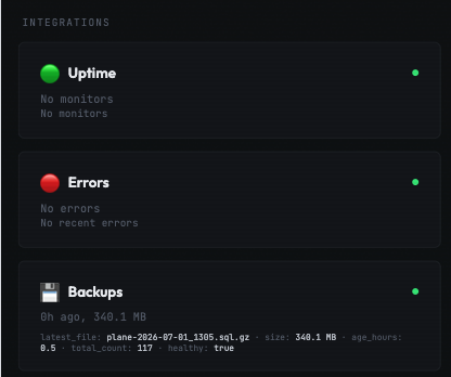
Buoy ships with seven built-in plugins, all disabled by default until you give them config: GitHub (notifications and open PRs), UptimeKuma (service health badges), Loki (recent error log lines), Plane (sprint and cycle progress), a Prometheus /metrics exporter, plus backup-status and cron-health panels. The Plane plugin is the one that surprised me by how much I use it; my current cycle progress shows up on the same page as my disk usage, and I stopped opening a separate tab for it.
Writing your own is deliberately small. Drop a .py file into the mounted /plugins volume, subclass the plugin protocol, and implement an async collect() that returns a panel:
from buoy.plugins.protocol import Plugin, PluginManifest, PanelData

class WeatherPlugin(Plugin):
    manifest = PluginManifest(id="weather", name="Weather", icon="W")

    async def collect(self) -> PanelData:
        # your logic here
return PanelData(status="ok", summary="72F and sunny")Each plugin gets its own refresh interval and runs in isolation, so one that errors out shows an error on its own card instead of taking the dashboard down with it. The full protocol, including optional custom frontend JS for a plugin, is documented in the plugin wiki page.
The fastest way to judge buoy is demo mode. It needs no Docker socket and no host access; it serves realistic fake data so you can click around the whole thing without pointing it at anything real:
docker run --rm -p 8090:8090 ghcr.io/gfargo/buoy:latest --demoFor an actual node, grab the example config, set the one required value (the node name), and bring it up:
curl -o buoy.yaml https://raw.githubusercontent.com/gfargo/buoy/main/buoy.yaml.example
sed -i 's/my-server/your-hostname/' buoy.yaml
docker compose up -d
# then open http://localhost:8090The image is multi-arch (amd64 and arm64), so the same line works on an x86 mini PC and on a Pi. In the compose file, privileged: true plus pid: host are what unlock the full set of host metrics (temperatures, all disk mounts, NVMe SMART data). If you only care about container stats you can drop privileged and keep pid: host, and the panels that need the extra access simply hide themselves. The complete buoy.yaml.example is heavily commented if you want to go further.
The design goal I held onto was that buoy should look good out of the box and never hard-fail because something is missing. No Docker socket mounted? The container panel goes empty and the rest of the page is fine. No NVMe in the machine? That panel hides itself. A plugin throws? Its neighbors are untouched. The dashboard is meant to be a calm, honest read on a node, which means it cannot afford to fall over the moment one input is unavailable.
The initial build-out is done, which is why there is no grand roadmap bolted to the README. What is left is tracked as issues, and the ideas I am most tempted by are a container detail drill-down (inspect, resource history, logs, restart from the panel), peer latency via Tailscale ping, and TLS certificate expiry tracking. None of those are promises; they are just where my attention drifts when I look at the dashboard and think “I wish I could click that.”
Buoy also pairs with my pironman5-oled project: the little OLED on the front of compass shows a tiny subset of this same data, and buoy is the full browser view when I want more than two lines on a 128 by 64 screen.
The repo is on GitHub at gfargo/buoy under the MIT license, and the demo one-liner above is the no-commitment way to see if it clicks for you. If you run a handful of machines at home and have wanted a single honest page per node, it might be a fit. Issues and pull requests are open, and I am genuinely curious which plugin other people reach for first.
Discussion
Comments are powered by Disqus. Sign in once, comment anywhere.

