July 03, 20267 min read
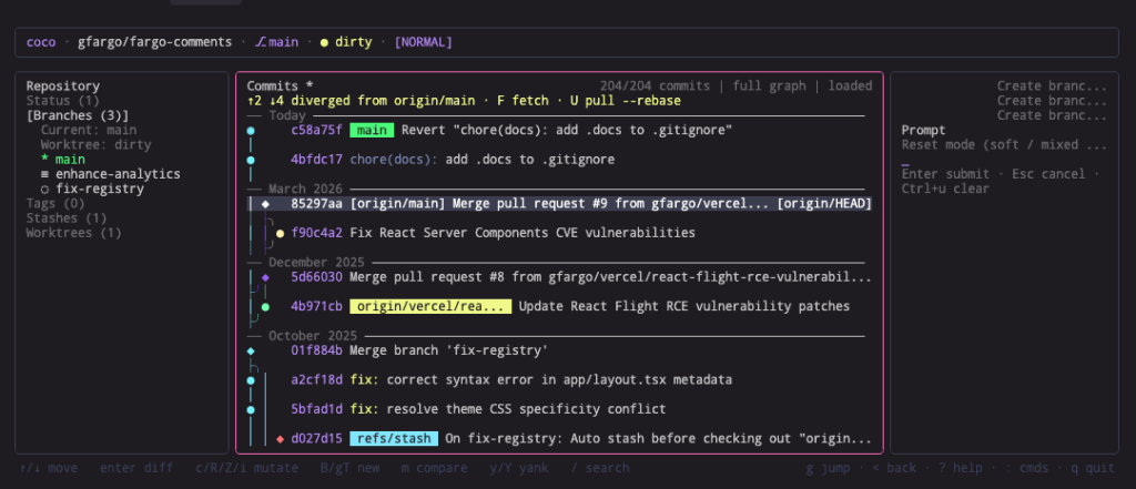
The commit graph is the first thing your eye lands on in a git TUI. In coco, my terminal git assistant, it’s the spine of the history view: the column of colored lines that tracks each branch and shows where they fork and merge.
For a long time it looked almost right. Close enough that I couldn’t immediately say what bugged me, far enough that something did. This is the story of how I rebuilt it, and why the fix turned out to be a data-model problem rather than a styling one.
The graph rendered by parsing the ASCII that git log --graph prints and swapping each character for a nicer Unicode box-drawing glyph. Vertical bars became │, the commit dots became ●, and so on.
The trouble was the junctions. A merge or fork connector never quite touched the commit it was supposed to join. It hovered a hair to the side, like a wire that stops just short of the terminal. I tried two rounds of fixes: rounded corners, then clean diagonals. Both looked better in isolation, and both still drifted.
git lays its lanes out on a two-column pitch: lane N sits at character column 2N, and the connector between two lanes lives in the odd column between them.
A box-drawing corner assumes a one-column step, so it always landed one column shy of the commit above it. A diagonal (╱, ╲) spans the full two-column gap, which fixes the reach, but diagonals meet at cell corners while bars and dots sit at cell centers, so they read as slightly detached too.
No glyph wins here, because the geometry is fixed by git’s output. I was trying to fix a rendering by changing characters, when the real problem was that I didn’t control the layout.
I already had everything I needed. Every commit carries its parent hashes, which is a complete DAG. So instead of reading git’s ASCII, I compute the lane layout myself:
├, ┬, and ┼ fall out for free from which directions a cell connects.Lines now meet at cell edges with zero offset, because the corner is placed under the commit on purpose rather than wherever git’s diagonal happened to fall.
on git's ASCII computed from the DAG
│ ● │ ●
│╱ (diagonal drifts) ├─╯ (corner sits under the commit)
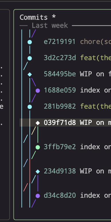
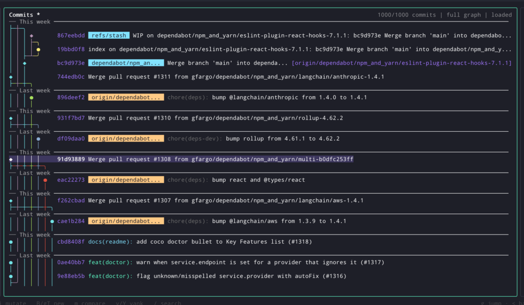
● ●On a real merge-heavy repo the difference is night and day: forks open with ├─╮, branches converge with ├─╯, and a lane holds one weight and one color the whole way down the screen.
When a rendering looks subtly wrong and no amount of tweaking the styling fixes it, check whether you own the right data model. I spent two rounds polishing glyphs on top of git’s ASCII before realizing the ASCII itself was the constraint. The moment I rebuilt the layout from the DAG I actually had, the thing I’d been fighting just went away.
It also shipped as a nice side effect: because the layout is computed once from the commit list and cached, lane colors are now stable as you scroll, and the whole graph got faster to reason about — both for the code and for the eye.
If you want to see it, it’s in coco — coco ui, then the history view.
Discussion
Comments are powered by Disqus. Sign in once, comment anywhere.